A key goal we have at TransitMatters is to empower grassroots advocacy for better transit. To achieve this goal over the medium and long term, we perform significant technical work to articulate specific improvements that need to be made for a more reliable, equitable, and capable transit system. Nowhere is this better demonstrated than in our Regional Rail project, especially in our recently released Regional Rail Phase 1 document released earlier this summer.
We also want to be able to influence short term and operational decisions. We want to be able to more effectively keep tabs on the T operational performance and capital delivery projects. While the MBTA has their own site to measure their performance, the information provided is extremely high level and difficult to both understand and audit. Not only that, it rarely reflects the experience of riders who can experience major delays and yet see performance statistics suggesting reliability is >90%. It is powered by significantly more granular data, but most of this data is kept out of easy public view. We have opened up that data to allow for a more nuanced perspective that we believe better reflects the experience of riders on the MBTA.
To that end, over the past few months we at TransitMatters have put together a team of data scientists, software engineers, and UI/UX experts (a/k/a TransitMatters Labs) to give the public better access to MBTA performance data. Our first effort, the New Train Tracker, was released earlier this year and provides real-time information on where new Orange, Green, and Red Line trains are currently running on the system.
Today, we at TransitMatters Labs are proud to introduce our first tool for independent analysis of MBTA performance, the TransitMatters Data Dashboard. For the Red, Orange, Blue, and Green lines, we now have trip by trip performance data for the past three months. For any station or station pair, you can see information on how actual MBTA trips performed on that day. We also have real-time updates for the current day!
For almost every station* on light and heavy rail, you now have the ability to view:
Travel Times: how long it took each train to travel between two stations on the same line, and how long it should have taken according to the MBTA
Headways: how long you have to wait between trains at each station
Dwell Times: how long trains remained stopped at each station
Additionally, for each day we highlight if and when an official MBTA service advisory was issued, and the text of that advisory.
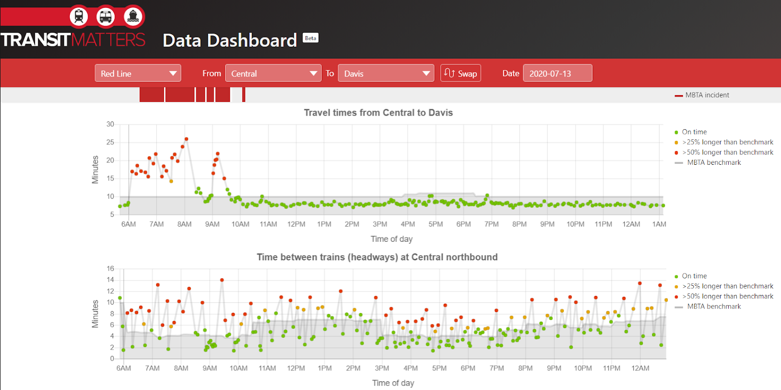
Here’s an example for what the app looks like for July 13th on the Red Line:
The bottom graph displays headways, or time between trains, at Central northbound. Each point (colored in green, orange, or red) represents a number of minutes between each train. The grey line represents the MBTA benchmark, or how long you should have to wait between trains. You can see how it moves up and down through the day, with shorter headways (= more trains) during peak periods, and longer headways (= fewer trains) during off-peak periods.
We color the dots based on the difference from the MBTA benchmark. Green indicates you waited an expected amount of time, yellow means your wait was a little longer than normal (25-50% longer, to be exact), and red means you had a much longer (>50%) than expected wait.
The top graph shows travel times, and behaves similarly to headways. To keep schedules, the T has a benchmark travel time for how long it takes trains to make the journey between two stops (we color this line as grey), which is how they determine the schedules for the trains. This travel time doesn’t change too much through the day, although there is a slight bump during PM peak, where train crowding can lead to longer dwell times at stations.
We mark each dot for the actual travel times, and color these dots based on how close travel times are to the benchmark. Similar to headways, a green dot for travel times means that once you’re on the train, the trip took about as long as you would expect. Yellow means that time on the train was longer than expected, and red means time on the train was much longer than expected. One interesting thing to see here is how for much of the day, actual travel times are far below the benchmark, showing padding the T adds when creating its schedules.
Now, on this day the Red Line had issues early in the morning, with trip times well above expected. We also have the ability to examine what the exact issue was by hovering over the red bar at the top:
You can also see examples where you may have felt there was a delay, but there was no official communication from the T. For example, here’s the Blue Line on a recent weekday. There were significant delays during the PM rush, but no alert from the T to let riders know!
Look out in the future as we roll out more tools to help better analyze the T and its performance. What MBTA data do you want to see visualized? What do you think the Labs team should build next? We’re excited to hear your ideas. If you have any questions, comments, bugs, or suggestions, please contact us at labs@transitmatters.org.
* Due to a change in how the MBTA records performance data, Park St and Kenmore are unavailable currently. We are working on adding them.